
4U by Tia
UX design | web design | brand application
An ecomm site for a brand new natural haircare brand.
Affordable options for natural curls are hard to come by
And Tia Mowry saw an opportunity, as well as an audience she wanted to serve. She partnered with Amyris to develop a line of haircare products formulated specifically for folks with curl textures from 2a–3c: kinks, curls and coils. Amyris’s in-house creative studio developed a clean, sophisticated but approachably playful brand identity, and I was tasked with designing a site and user experience that would embody Tia’s effervescent personality and introduce the customer to this unique product line.
Phase 1: The Teaser Site
Before the launch of the main site, the brand needed an opportunity to connect with their future customers: to give them an idea of what the product line was going to look like, to build anticipation, and collect contact info.
I worked with cross-functional leadership to develop a concise page that gave future customers a glimpse into the 4U by Tia brand.

Phase 2: The Ecomm Site
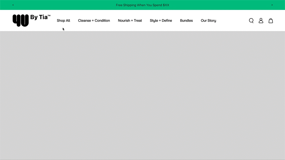
Tia’s products were going to be available in Walmart stores, at Walmart.com, and on her own direct to consumer ecomm site. I designed the site with direction from cross-functional leadership, keeping in mind both universal and internal standards and best practices.
My full design included the entire site, from homepage to footer, all Product Display pages, Collections pages and everything in between. This case study will focus on the navigation to show a sample of my process, and how the team worked iteratively over time to improve the customer experience.
MVP: Navigation at Launch
One of the primary challenges of 4U by Tia was how to divide the product offerings to allow customers to navigate them effectively. The brand was launching with only 8 products, all of which are effective for all curl types and textures – a unique product design within the category, as most curl-specific products are formulated for (or are especially effective on) a relatively small range of curl types and textures.
The challenge was grouping the products into intuitive categories, and educating the customer on the broad efficacy of the products.

Early sketches of how to divide Tia’s products in the navigation
After rounds of iterating, it became clear that the most intuitive way to divide the products was by product type and function.
Since all products can be effective on all hair types, there was no way to divide the products up by which hair type they were recommended for (and doing so would create confusion for the customer: if all products work for everyone, why would they be divided?). And since the product line was so small at launch, dividing products by concern or hair goal would result in product category pages with only a single product, not the best way to encourage customer discovery and educate about the full breadth of the product line.

Mobile Navigation final design prototype
Surfacing Product Categories: Navigation 2.0
After a few weeks live, the data showed that customers weren’t interacting deeply with the navigation: they weren’t discovering the categories and learning about the wide applications of the product line. In order to remove barriers to customer discovery, we eliminated a layer in the navigation so that the product categories were always visible. We also re-named the categories in an effort to more fully describe the products contained within them.
Responding to User Feedback: Navigation 3.0
Our team conducted a user study with a section focusing specifically on the navigation. We wanted to know if customers understood the categories, knew where to look for specific products, and how they felt about the categories and their names.
Through the study we learned that customers found the category names confusing, we were not including products that they expected to see in some categories, and we were duplicating products in other categories and including them where customers didn’t expect to find them.
In response to this feedback we simplified the category names and reorganized which products were included in particular categories to ensure customers could find what they were looking for.
